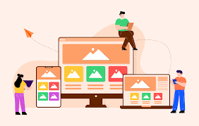
At TEMS Tech Solutions (TTS), we specialize in creating responsive website designs that adapt seamlessly to different devices, including desktops, tablets, and smartphones. Our approach ensures that your website delivers an optimal user experience across all screen sizes.
Key Steps in Creating a Responsive Design:
1. Mobile-First Approach:
- Start by designing for smaller screens (mobile devices) and progressively enhance the design for larger screens.
- Ensure critical content and features are visible and easily accessible on mobile devices.
2. Flexible Grid Layouts:
- Implement flexible grid systems using CSS frameworks like Bootstrap or custom CSS Grid.
- Use percentage-based widths for elements to ensure they resize proportionally as the screen size changes.
3. Media Queries:
- Use CSS media queries to adjust the layout and styling for different screen resolutions.
- Set breakpoints for common device widths, including:
- Mobile: 320px – 480px
- Tablet: 481px – 768px
- Desktop: 769px and above
4. Responsive Images:
- Implement responsive images using the
srcsetattribute to serve the correct image size based on the device’s resolution and screen size. - Use lazy loading to improve performance by loading images only when they appear in the viewport.
5. Fluid Typography:
- Use relative units like
em,rem, or%to scale font sizes according to the screen size. - Ensure text remains legible on smaller screens without overwhelming the layout.
6. Navigation Optimization:
- Design a mobile-friendly menu (e.g., hamburger menu) for smaller devices to save screen space.
- Ensure the navigation bar adapts based on screen width, with dropdown or off-canvas menus for tablets and smartphones.
7. Touch-Friendly Design:
- Increase button sizes and spacing for touch interactions on mobile and tablet devices to avoid user frustration.
- Ensure all clickable elements are large enough to be easily tapped.
8. Testing Across Devices:
- Test the responsive design on real devices and simulators, including Android and iOS smartphones, tablets, and various desktop resolutions.
- Use tools like Google Chrome DevTools or platforms like BrowserStack to test responsiveness across multiple devices and browsers.


Reviews
There are no reviews yet.